Here’s a link to my final presentation (in Dutch): presentatie. The last slide (after the thank you note) contains the usual statistics.
Yesterday I tweeted about a question I had involving the evaluation of the SUS scores of my application and the current system, but I did not get an answer so far, so I’m trying this way as well ;).
Brooke said in his paper that the scores for individual items are not meaningful on their own. Bangor et al. first ignored this statement and did examine the individual responses of their participants. But after their study, they also concluded with “Although examining individual statements is appealing, the statement-by-statement analysis shows that there is not much differentiation among the statements.”
However, my supervisor thought it would be a good idea to look at the individual responses to see whether there was an question that got a lot of different answers. Looking at the individual scores of the SUS statements for my application, you can see that the answers for question 3, 7 and 9 are a little divided, but not in an alarming way. These three questions are related the strongest when looking tot the analysis of Bangor et al. (Note: I took the absolute value of the negative questions, so in the graph a large number means a high score.)

Looking at the scores for the SUS statements for the current system, we see other things…
 The scores of almost all statements are divided over almost the entire interval…
Of course, now I can start extracting all sorts of statistics, but is this really necessary/an added value to my thesis? What do you think about evaluating the individual scores of the questions? How did you evaluate the SUS questionnaires in your thesis?
I’ve made some changes to the lay-out of my poster and I decided to make it in English: Poster 2.1
In this post, I will explain the difficulties that occurred during the tests, like actions that were not clear to the users, or problems with the application itself.
The reading list
The CBA consists of four different collections: WBIB, WMAG, WDEP and WAIT. The WBIB collection is the collection on open shelf, where users can get the books themselves. The books in the other collections can be requested. WMAG is the collection in the stack, in the basement of the library, so a request takes about 15 minutes to process. WDEP is an external collection, but the internal posting services brings the requested books to the library once a day. The books in the WAIT collection are distributed all over campus. These are the books that belong to the personal collection of the different departments. Such a request takes a few days to process.
Of course, the Limo catalogue also consists of books which are in other libraries of the KU Leuven and other institutions.
Problem – In the reading list of my application, I tried to make a distinction between the books which are available on open shelf, the books that are from the CBA, but have to be requested and the books that are from another library. Therefore I thought the best way to make this clear would be to use different colours. However, not all test users found it as clear as I thought it was. Seven out of the twelve users could not find out what the colours meant or mentioned they did not find it very clear.
Solution – There are a few possible solutions for this problem:
- Explain the different colours somewhere on the top or the bottom of the page.
- Explicitly denoting the location of the book: not just writing ‘available’, but for example ‘available in WMAG’. I don’t know how well this will work, because there is not much place on the screen…
Adding a book to the reading list
Ten out of the twelve users used the ‘+’ button on the top right corner of the screen to add a book to the reading list. The two others used the menu button.
Problem – Some users thought that the title bar was an editable field, where they could enter the title of the book they were looking for. This was already mentioned during my presentation and now it was confirmed by some other users.
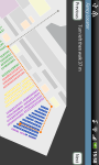
Solution – I changed the lay-out of my application a little after the first day of testing, as can be seen in the following picture.

From then on, nobody thought he/she could type in the title bar, so this problem is solved.
Problem – When the users clicked the ‘search book’-button or pressed the enter button, the application sent a request to the catalogue to find books corresponding the search term. When there was more than one result available, I showed the results using a ViewPager. This is a layout manager that allows users to swipe between the different pages. To denote that there were more pages available, I added the text ‘result x of y’ in the top middle of the page and part of ‘result (x+1) of y’ in the top right of the page, as can be seen on the left of the next picture. This was not very clear to most users.
Solution – I changed this as well together with the lay-out changes explained in the previous section. I made the text to denote the page larger and I added a small arrow in the middle of the page.

This change did not solve the problem completely. There were still some users that did not immediately notice that there were more results available. I guess that if I make the arrow a lot larger, that it will be clearer.
Selecting a book from the reading list and looking it up
All twelve users used the magnifying glass on the top right corner of the page to look up the book they selected. After a user clicks this button, the application will load the map and determine the starting location of the user. Next, the application will show the route, the user has to follow and add a ‘start routing’ in the top middle of the screen. When the user clicks this ‘start routing’-button, the application will give him an instruction of the form ‘turn left, then walk 15 meters’. Each time the user clicks next, a new instruction will appear on screen until the user has reached the location of the book.
Problem – Important to notice is that two users did not see the ‘start routing’ button and followed the path that was shown on the map without the instruction. Another user did click on the ‘start routing’ button, but then he never clicked the next button and also only followed the path that was depicted on the map.
Five users clicked the ‘next’ button on the wrong moments. This was mostly because they did not read the first instruction with enough attention. The first instruction had the form ‘Locate the starting point and walk 11 meters’. Most user just read this as ‘locate the starting point’ and then they clicked ‘next’. This had the consequence that they did not always find the right shelf immediately, because the instruction had already passed and the map already disappeared.
Solution – I’m not really sure how to solve this problem. I make the ‘start routing’ button a lot bigger, of place it in the middle of the screen, so that the user have to click this button before they can see the path on the map. On the other hand, maybe instructions as ‘turn left and walk x meters’ are not really an added value to the application. Nobody actually checked whether the length of the path was indeed as long as the application said it was. I also think that most users would have been able to find the location of the book without these instructions. Unless the application can show the exact location of the user while he/she is walking, this will not add much value.
Positioning
In the picture below, I denoted the location where the users started with a dot and the location where my application thought they were with a cross. The number indicates the number of the participants. A different color means a different day.

Most of the time the API found a location that was close enough to the location where the user was. Only in some cases (for user 1, 8 and 12) the location was not determined very accurately (but it wasn’t a disaster either, so I’m still happy about the results!).
There were more problems with the other API. As I already mentioned during my presentation, it sometimes let users walk through walls, which is not an easy thing to do… This problem could also occur between the shelves. If a user does not pay attention, he will be looking for a book on the wrong side of a shelf. I should be able to solve this problem by adding more paths in the map editor.
Another remark that was made by the users was that they would like the map to turn like a compass. I am aware that this would make it easier to orientate yourself inside the building, but unfortunately this is not (yet) a supported feature of the Ericsson Labs API.
Remark – The positioning API worked well at the entrance, the group work space (where the users started) and the reading room. From the moment you enter the room where the shelves are everything goes wrong. I think the shelves interfere too much with the WiFi signals to get an accurate positioning system.
Removing a book from the reading list
When the users finished the scenario, I also asked them to remove the book they just look up from the reading list. I thought that this would be an easy task, but I was proven wrong. I added the ‘remove book’ functionality to the menu button of the reading list. So in the main screen, the user had to press the menu button and choose ‘remove book’. He would then be forwarded to a new screen, where he could select the books he would like to remove.
Problem – Only one user immediately used the menu button. Seven users clicked a book and were looking for a way to remove the book there. The other four long pressed the book and expected a context menu to pop up. The users who first clicked the book and could not find the remove functionality then tried to long press the book in the reading list and vice versa, the once who first long pressed the book, then tried to click the book and look for the remove functionality there. Clicking the menu button in the reading list was their third option, but in some cases (3) they just said ‘I’m sorry, but I don’t know how’.
Solution – To solve this problem, I will have to change the remove functionality. I am thinking about changing the interaction a little. When the user clicks the book, a context menu will pop up where the user can select to ‘look up’ the book, to ‘watch detailed information’ and to ‘remove this book’.
Conclusion
Let’s sum up all the changes I will have to make:
- Find another way to distinguish the books that are available in the CBA and those that are located in another library.
- Make it more clear when there is more than one result. Making the arrows bigger, will probably solve this.
- Change the ‘remove book’ functionality. I will probably add a context menu that pops up when the user clicks a book in the reading list.
- Make the buttons more visible. I will probably make them bigger, but I think I will also replace the icons with words to make it extra clear!
- Do something about the locator. (This will be very difficult!)
- A possibility would be to show the location of the user while he is walking, so that he can see where in the building he is. This is however not an easy problem, because the positioning API does not work between the shelves.
- Another improvement would have been if the map was able to turn when the user turned his/her smartphone. As I already mentioned above, this functionality is not embedded in the API. I will try to find an alternative that will help the users to orientate themselves better. I am thinking about an arrow that turns as you turn, like they use in the Google Maps application.
- Extend my application? There are a lot of extensions that can be implemented, but I’m not sure whether I will be able to finish them by next month…
- I can make the overlay functionality. When the user reaches the right shelf, the application will change to camera view. The user can scan the shelves and the application will show him the exact location of the book.
- I can use the locator to find related material
- …?
I will definitely make the changes needed to improve the design and the usability. These changes should not take too much time, since it are all minor changes. The problem with the compass will probably take a little longer to develop, but the time should be reasonable.
I am not sure whether there will be enough time to extend my application. I think that implementing the overlay functionality will take me too long. Last year, Michaël already created a system to find recommended material, so maybe I can reuse parts of it. On the other hand, this will probably not create much added value to what my thesis is about. My thesis is about creating an indoor locating system that will guide users to the library. Finding related material will be a nice extra, but it’s not part of the core functionality.
Always interested to hear/read what you think about all this! Any tips/remarks/comments/… are very appreciated!
During the easter ‘holidays’ I’ve been busy testing the first implementation of my application. Some screenshots of my application can be found here.
To start, I gave all the users an explanation about what was going to happen and what was expected of them. For this iteration, I wanted to focus a little more on the usefulness of my application. Therefore, I let the users search for two books, one with my application and one with whatever means they preferred (there was a laptop which they could use to browse the catalogue).
After the tests, the users were asked to fill out a questionnaire. This questionnaire included some general questions to get to know the test users. With these questions I wanted to know how familiar they were with the library infrastructure and multitouch devices. Then there were some questions to compare my application with the existing catalogue functionalities. With these questions I wanted to know whether the users found it easier/faster to work with the application than without. These questions were loosely based on the ASQ-questionnaire. Next, there was the familiar SUS-questionnaire and at last, I let the user choose a few words out of the 118 product reaction cards (this is the word document with the words). My entire questionnaire can be found here.
While the users were performing the two tasks, I measured the time it took them to find the book in the catalogue and the time it took to find the book on the shelves. I also had a checklist with me to make notes about the things they did.
General Questions – Getting to know the test users
In total there were 12 participants. Eight of them were male, four of them female. They were between 21 and 42 years old. Four of these participants work in the library, so they are very familiar with the library infrastructure. Among the others, some visit the library a few times a year and some never visit the library. Most participants are familiar with multitouch devices.


Comparative Questions – Is it easier / faster to work with the application?
These questions had to purpose to find out whether the users were happy with my application and whether they think it is easier and faster to find a book with the application than without the application.
To check if the users who work at the library thought differently about my application, I split up the results of these questions. But since there were no major differences between the answers of the users that know the library very well and those who don’t know the library, I decided to put the results back together.
Let’s take a look at the results:


What we can conclude from these results:
- All users were happy with the time it took to perform the actions to find a book with the application. These actions consists of searching for the book in the catalogue, adding it to the reading list and following the instructions on the map to find the book.
- Most users think the application iseasy to use. One of the users who answered this question with ‘neutral’ was a little confused while using the application. He could not immediately find the functions he needed, like ‘add book’ and ‘add to reading list’. The other user had some difficulties with using a smartphone. I could tell he wasn’t really familiar with smartphones, even though he answered the question ‘how familiar are you with multitouch devices’ with ‘a little’… He also had some problems finding the right buttons.
- Three out of the twelve users did not really find it easier to find a book with the application than without the application. They found it as easy as finding a book in the catalogue.
- One person disagreed that she could find a book faster with the application than without. Three persons found that finding a book with the application was as fast as looking up a book without the application. Two out of these four people work at the library. The other two also answered ‘neutral’ on the preceding question.
Actually, only in four of the twelve cases the users managed to find the book faster with the application than without. In six of the twelve cases, they could find the book to add to the reading list faster in my application than with the current catalogue.
From the moment they start walking towards the book, the application slowed everyone down. I think this is because in the case without the application, one had to memorize the map that can be found in the catalogue before they could go get the book. In the case with my application, they could just click ‘start routing’ and the application will show them the way. After the map is shown, the users have to orientate themselves while walking. Every time they walked a while, they had to click ‘next’ to get the next instruction. These times vary between 9 seconds and almost 2 minutes. The higher times are mostly due to the fact that it took the users quite some time to find the book on the shelves (sometimes over a minute). - Most users find the application useful. The one who answered with ‘neutral’ also answered with ‘neutral’ on the two preceding questions.
- Most users would recommend my application to other library visitors.
SUS Score of My application vs. SUS Score of the Current System – How user friendly is my application

I’m really happy about the results of the SUS questionnaire. As can be seen in the picture, all users gave my application a higher score than the current system.
My application received an average SUS score of 88.54, which is quite high! On the SU Scale, this value lies just after the ‘Excellent’ mark.
The current system received an average SUS score of 57, which is just after the ‘OK’ mark on the SU Scale.
In the picture below, the green arrow shows the SUS score of my application; the orange arrow shows the SUS score of the current system.

Word Cloud
In the last question of my survey, the users were asked to pick at least three words that best described how they felt about the application. The results can be found in the following picture:

The words that come forward are ‘useful’, ‘easy to use’, ‘convenient’ and ‘efficient’. No one picked a negative word, so I’m very happy about that as well! 🙂
Coming up
Next, I’ll write about the general remarks I have about my application. I will describe the things that didn’t work out as I expected and the changes I will have to make.


Here are some screenshots I took from my application. The main screen of the application is the list with books the user want to look up in the library. The user can add books by clicking the ‘+’ button in the top right corner. The title is a mandatory field, the other fields are optional. When the book is found in the catalogue, the application will show the results. The user can choose the book he would like to add to his reading list. In this list, the user can also select a book to look up. At first, the application will show the user some detailed information. In this screen, the user can decide to look up the book by clicking on the magnifying glass. The application will then determine the location of the user and show the path he has to follow on a map.
The poster I created can be found here: Poster.
Any tips, remarks, … are very welcome! 🙂
Coming up: a blogpost about the user tests of the past weeks.
Hi there!
If you’re interested to participate, you can register at http://www.doodle.com/63gfg8ph4s6a5x48. Your participation will be appreciated! 🙂
The evaluation will take place at the Arenberg Campus library, W. De Croylaan 6, 3001 Heverlee.
Thanks!
Here is a link to my second thesis presentation: Presentation 2
And here is a short demo video:
Soon another blog post with some implementation details will follow!
Finally it’s here: my first (draft) scientific paper ever! 🙂
An Indoor Locator Application for Academic Libraries – Draft
